The Rams announced that they will be wearing throwbacks at Super Bowl LIII
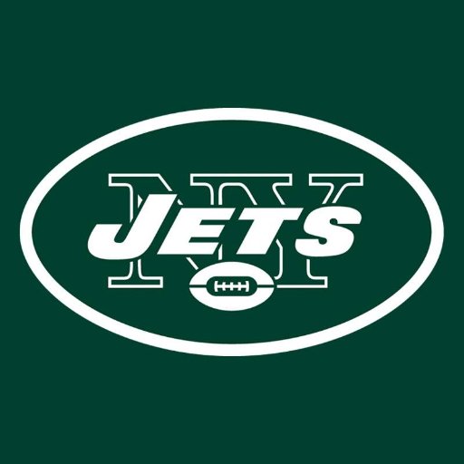
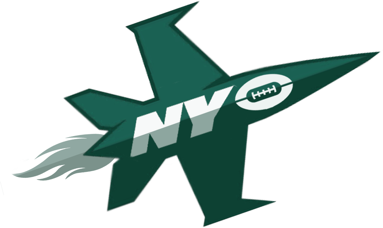
Changes Coming to the Jets
As we posted yesterday on our Twitter (@LinesLogos) the Jets are getting a complete uniform and logo makeover. As of right now everything is hush-hush, but it will be interesting to see what they come up with. It has been a while since the Jets last made changes. Tell us in the comments what you would like to see in new Jets logos and uniforms. Below are some old Jets logos as well as some concept logos.


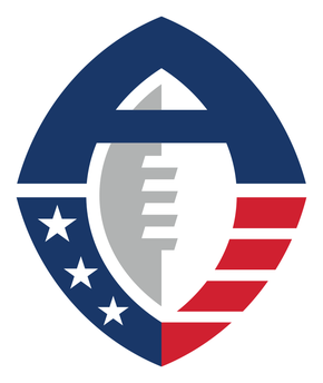
The AAF
The AFF is a new football league set to premiere after the end of the NFL season on Saturday February 9, 2019. They have some great logos and unis, which we are going look at below. All jerseys are available for purchase at: https://aaf.com/product-category/alliance-jerseys/
The season schedule can be found at: https://aaf.com/2019-season-schedule/
 Arizona Hotshots
The Arizona Hotshots start us off with some very colorful jerseys. The colors are subdued, but pop with the red on the sides. Incorporated into the logo is the traditional fireman’s logo with crossed axes. The script kind of resembles the one used in the movie Hotshots.
 Atlanta Legends
The Atlanta Legends come out strong with dark purple and yellow unis. In a strong show to Atlanta, the jersey features “ATL” in numerous places. The word Legends is in a script, which adds a “pop” to the jersey.
 Birmingham Iron
The Birmingham Iron utilize a classic all black design. Side stripes and a block “B” logo on an iron football also appear on the jersey. Iron is displayed in a bold font.
 Memphis Express
The Memphis Express will roll onto the field (see what I did there?!?!) in these sharp looking jerseys. The red, white, and blue has a great side design and their logo on each shoulder. The word “Express” is written in a fast, forward moving font.
 Orlando Apollos
 The Orlando Apollos are set to take off in a very cool combination of orange, blue, and white. The team logos take are predominately displayed on the shoulder. The script for the word “Apollos” gives a very Sci-Fi/space feel.
 Salt Lake Stallions
The Salt Lake Stallions will ride into the AAF in a combination of powder blue, navy, and white unis. The script used for the word “Stallions” is bold and gives a sense of forward motion.
 San Antonio Commanders
The San Antonio Commanders will wear this interesting jersey combination of red, maroon, and white. Most teams choose either maroon or red. The Commanders go with both. Like the other AAF jerseys, we see the logos on the shoulders. The script for Commanders is bold, apropos of their name.
 San Diego Fleet
Finally, the San Diego Fleet will be wearing a classic combination or yellow and black. As their name entails, the jersey has a nautical theme. The word “Fleet” is printed in a script that one would see on a Navy destroyer.

Wild Card Weekend
One of the best weekends of the NFL season is upon us and we have some good games on Saturday and Sunday.
The Wild Card logo this year sadly stays the same. This is perhaps one of the NFL’s most boring images. Other than the angle of the image of the football slightly resembling the Lombardi Trophy, it leaves much to be desired.
Enjoy the games!
Bowl Winners
A good break down of the bowl winners and the hype surrounding them.
December 31 Podcast
Check out our first podcast

Week 17 NFL Unis
The final week of the NFL season is upon us and we have some pretty good uniform combos.
The Cowboys at Giants feature a classic uniform matchup. The Cowboys in white with their traditional pants and the Giants in blue with white pants.
The Titans match up with the Colts today in very cool unis. Dark blue jerseys, silver on the shoulders, and blue trim. The pants complete the uniform in light blue matching the trim on the jersey.
Overall, some very good matchups today. Enjoy!
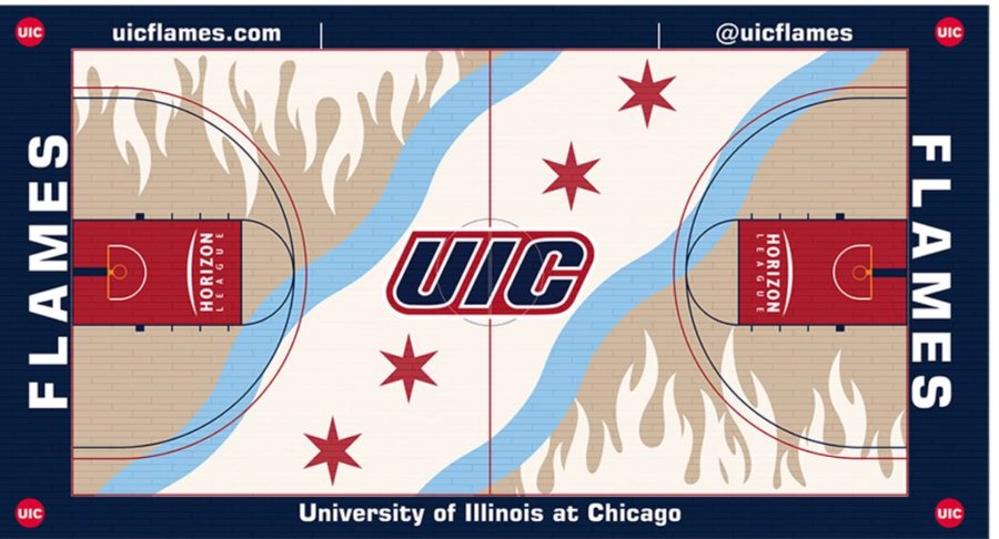
Unique College Basketball Courts
https://www.si.com/college-basketball/2018/11/01/uic-flames-new-court-design
A great perspective of unique college courts.
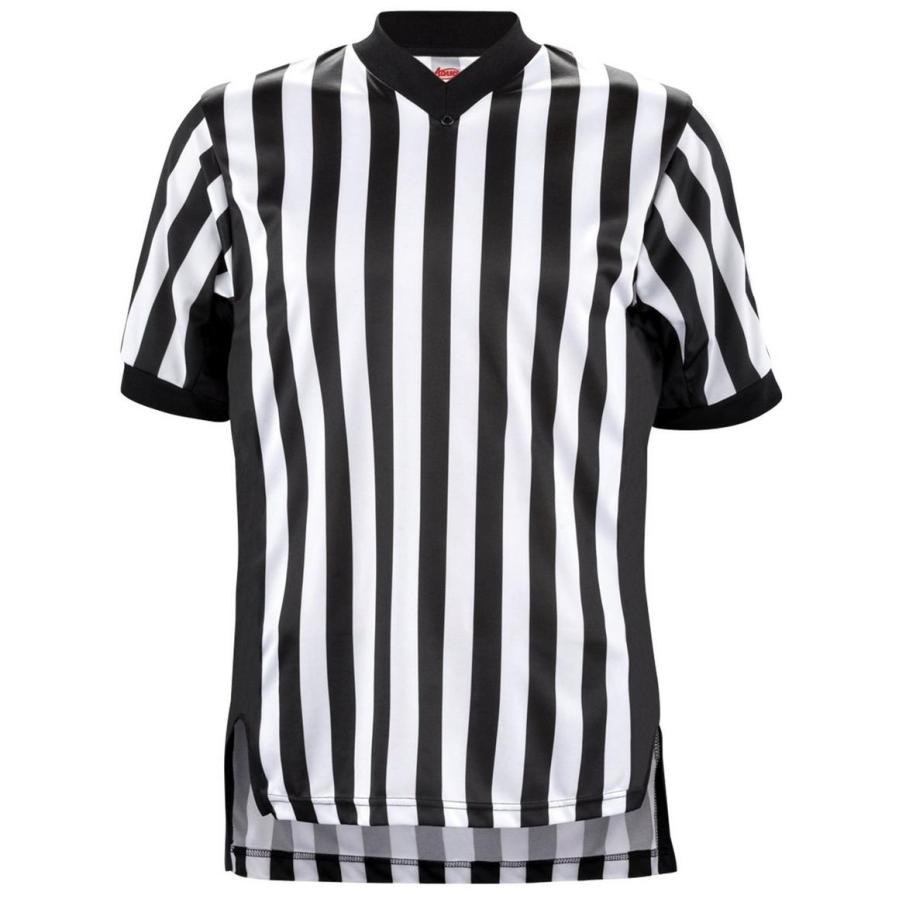
Ref Patches
In all major sports, the refs or umps wear the logo of the playoffs, Super Bowl, etc. It’s interesting that this is not being done in Bowl Games or the semi-finals.
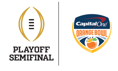
Orange Bowl
The second semi-final tonight has OU facing Alabama. The Orange Bowl logo stays the same as in years past, highlighting the Capital One name.
The field, like the Cotton Bowl, has the Orange Bowl logo at mid field, the sponsor (Capital One) logo on either side of the field, and the BCS logo on either side of the fields and in the end zones. Two big differences are that the school wordmarks are backed by school colors in the end zones. Additionally, something that is very cool, is that we see the traditional font yard numbers outlined in school colors. Now since both schools use a deep red, the entire lot of yard makers are outlined in the red. It would have been cool to see different team colors for a contrasting view. Overall this is one of the best field schemes we have seen so far.
